

Technology system changes are often driven by a desire to improve data in two areas:
- Operations: improve user experience, reduce time spent on a certain task, meet regulatory requirements, reduce errors
- Analytics: collect or restructure data to improve access to information, drive better insight and decision making
Some work falls entirely in the first category, some entirely in the second, and—increasingly—with an eye toward both categories. Regardless of where your work focuses, you can use charts and diagrams early in the process to achieve alignment and improve outcomes.
Process maps are one way in which visuals can be used in the evaluation and design phase of a change. They frequently support operational improvements by clarifying the order of operations, criteria to evaluate, and responsibility for each sequential action.
Although the outcome of analytics work is often presented in reports and dashboards, it’s less common to use visuals in the design phase of this type of work. This doesn’t need to be the case! Sketching out sample charts is a simple exercise that can happen early in the process. It will either confirm that everyone’s on the same page, or highlight issues that will be much less costly to address now rather than once your new dashboards are live.
Make sure you know the question
Framing a report as a way to answer a question is a useful way to think about analytics. What exactly are the questions we want to ask and what might an answer look like? You don’t need to know the exact numbers to settle on the shape of the answer. What, precisely, will be measured? What types of groupings or aggregation will be helpful? 42 might be the right answer, but it’s meaningless when we can’t articulate the question—and the more work that goes into producing an answer, the greater the stakes for knowing what the question is.
Consider not just the cost of rework, but also the organizational cost of decreased trust in the data or the challenge of resetting a point of view created by one problematic report. Drawing a hypothetical answer forces you to be very explicit about the question, and moving this point upstream in the development process (clarify what you need before building it) can reduce the overall cost by orders of magnitude.
What it looks like
At Pedal Lucid, we happen to like Miro, but any whiteboard tool you’re comfortable with is a great choice. The key is to align on expectations before changing the system, not create a keynote slide!
Tips:
- Make sure the group participating is the right audience—people who will actually use the reports
- It’s fine to start with an outline and have periods of asynchronous work, but live workshopping sessions work best
- Talk through what kind of ratios or numbers you might expect to see, even though the data is hypothetical
- We often use segmented bar charts because they come together quickly and don’t require a lot of explanation to understand, but chart type is only limited by what will help communicate with your audience
Marketing Touchpoints
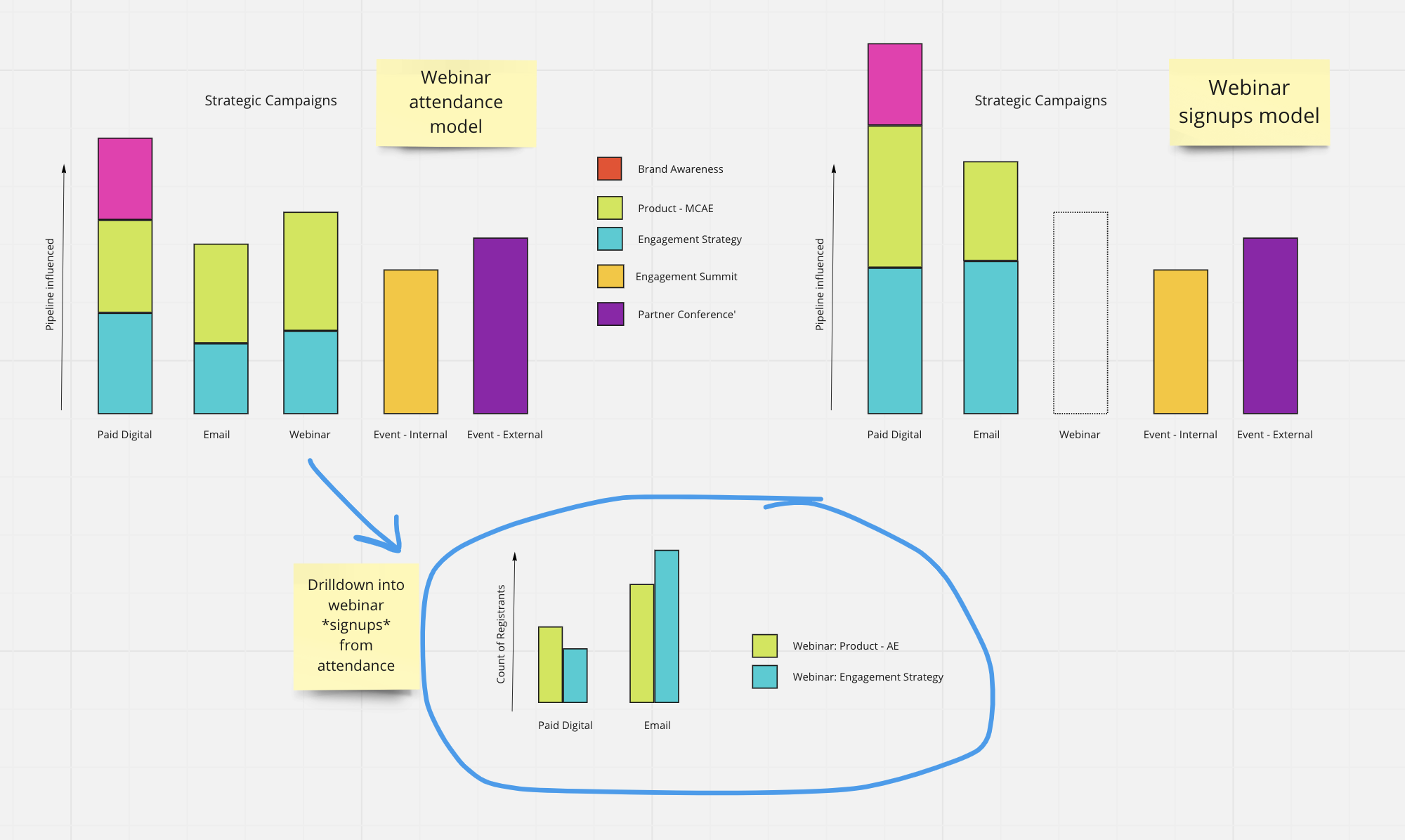
This example shows how different ways in which a marketing platform can be configured will influence top-level reports—specifically, whether to attribute revenue to webinar signups, or only if someone attended. Using a diagram early on helps ensure that data is structured in a way that matches assumptions. In this case, that standard reports should only include the influence of a webinar on a purchase if someone actually watched it.
Product categories
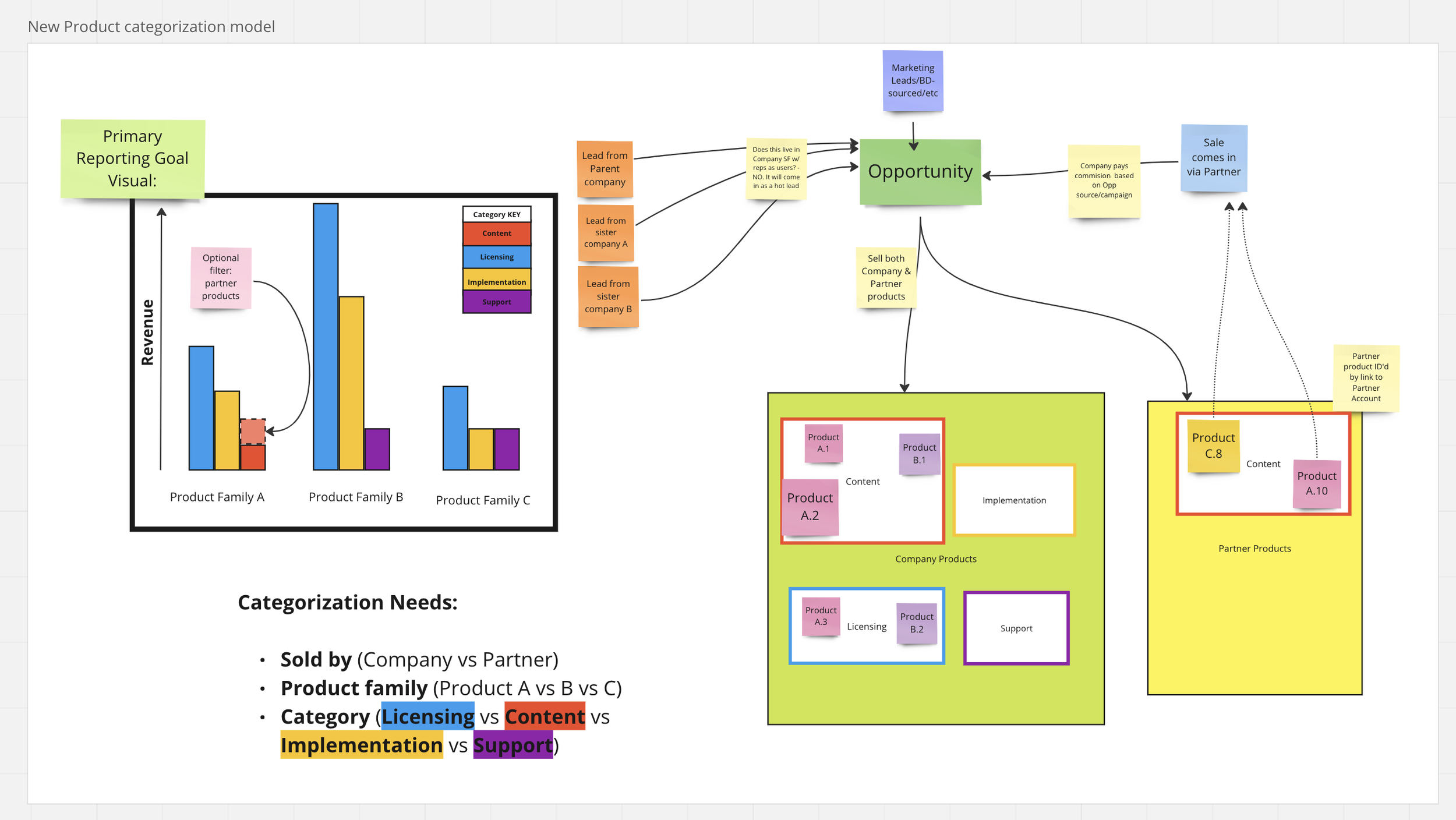
It’s common for the way a system is used to expand while the structure remains static. In this example, product lines grew more complicated over time but the way they could be categorized in the database did not. This created confusion and inconsistent reporting based on ad hoc filters. Starting a revamp with a visual of the ideal, top-level executive report helped break a single ‘product family’ field into three distinct ways in which products could be categorized and satisfied all stakeholders.
Tip: if reports often include filters such as “Name Contains: [ABC]” rather than “Category is: [XYZ]” it’s probably a sign to review how your data is structured!
Programs & Issues
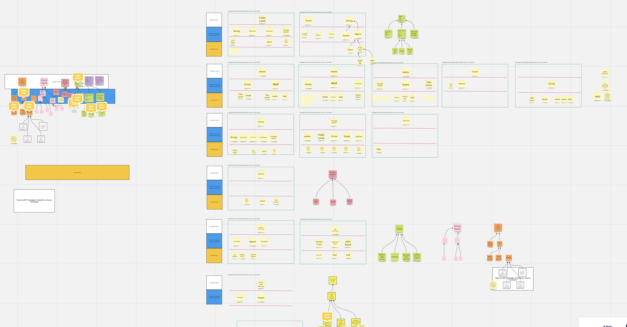
It’s big! It’s messy! It’s tough! It is… taking the time to map out how day-to-day constituent engagement connects to programmatic areas of focus and specific issues within those programs.
What are the goals of the organization? How do daily actions further those goals? How can technology systems tie these concepts together in a useful way? This work took place over multiple sessions and helped to set the stage to finalize what’s tracked in a way that creates meaningful reports—for the first time, the ability to look holistically at engagement data and group it in ways that relate to the objectives of the organization.
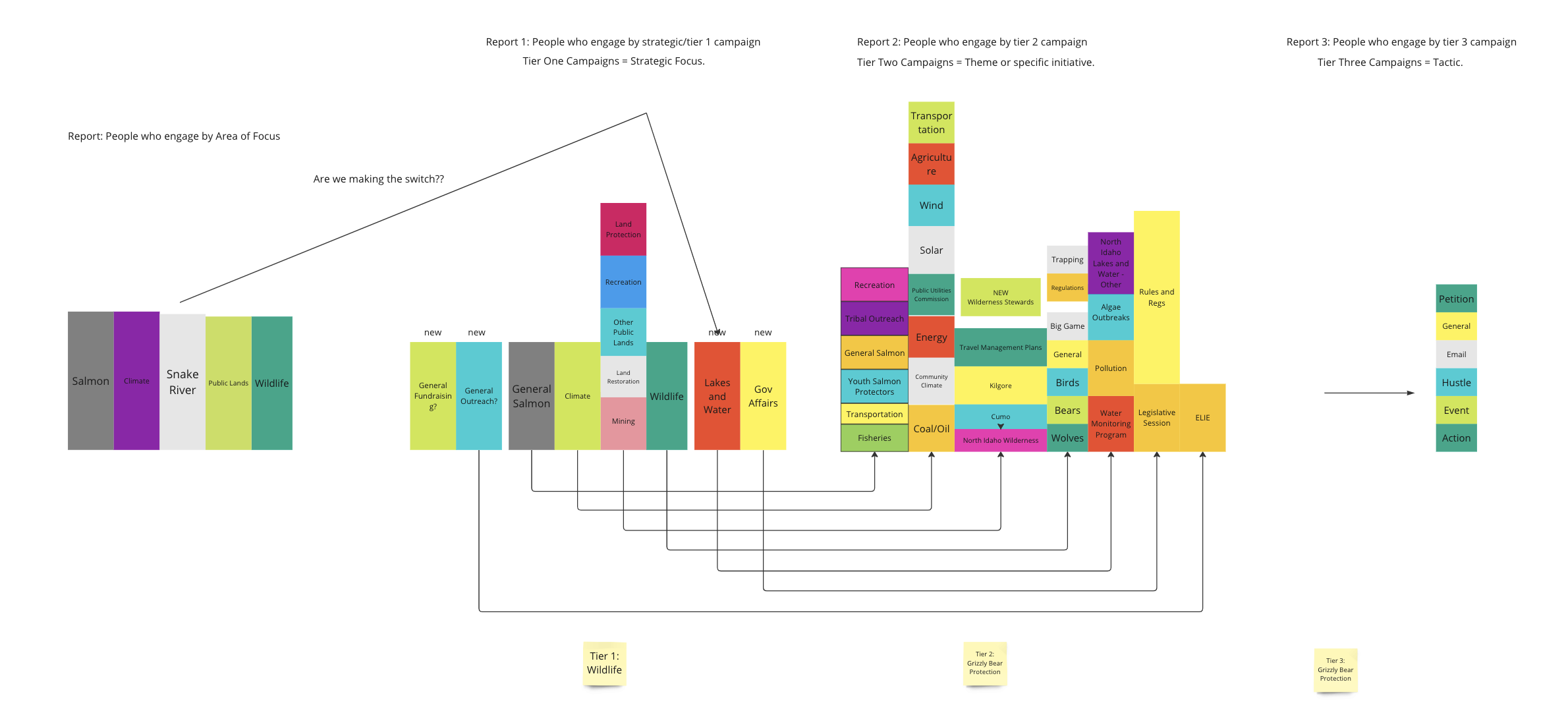
This view takes the map (above) and translates it into a series of hypothetical reports. It visually demonstrates how layers of engagement (specific action > particular issue > program area) can nest within each other. This means it can answer questions like how many supporters engaged with a certain topic, or how many dollars were raised in explicit support of that issue.
Drawing a chart helps bridge the gap between the more abstract work up top and how that translates into day-to-day operations and high quality data. In the words of one staff member in the middle of a major data cleanup and restructuring effort: “the Miro board is my chain to reality when we’re talking about Salesforce.” The drawings continue to serve as a useful reference point to return to and its value as a resource is not limited to the design phase of the project.
A Picture is Worth [Ten] Thousand Words
From strategy whiteboard sessions to process mapping to reports and dashboards, visualizations are a key tool used by well-run organizations. They can help us brainstorm, manage workflows, and share ideas with each other.
Proactively articulating the questions you want to ask and answers you expect when working with data doesn’t mean it needs to be structured in a way that limits exploration or discovery. What intentional design will do is increase the likelihood that you’ll be able to ask the questions you want and get a useful answer. The use and importance of data in our working lives is only going to grow, and a visual aid can help tremendously.
Take the time to draw your data. It’s worth it.